Guides
Best Fonts for Lyric Videos: What Reads on a Phone, by Genre
Which fonts work best for lyric videos on TikTok, Reels and Shorts: weight, outline, size, placement, genre styles, and when to use a lyric preset instead.
Start free
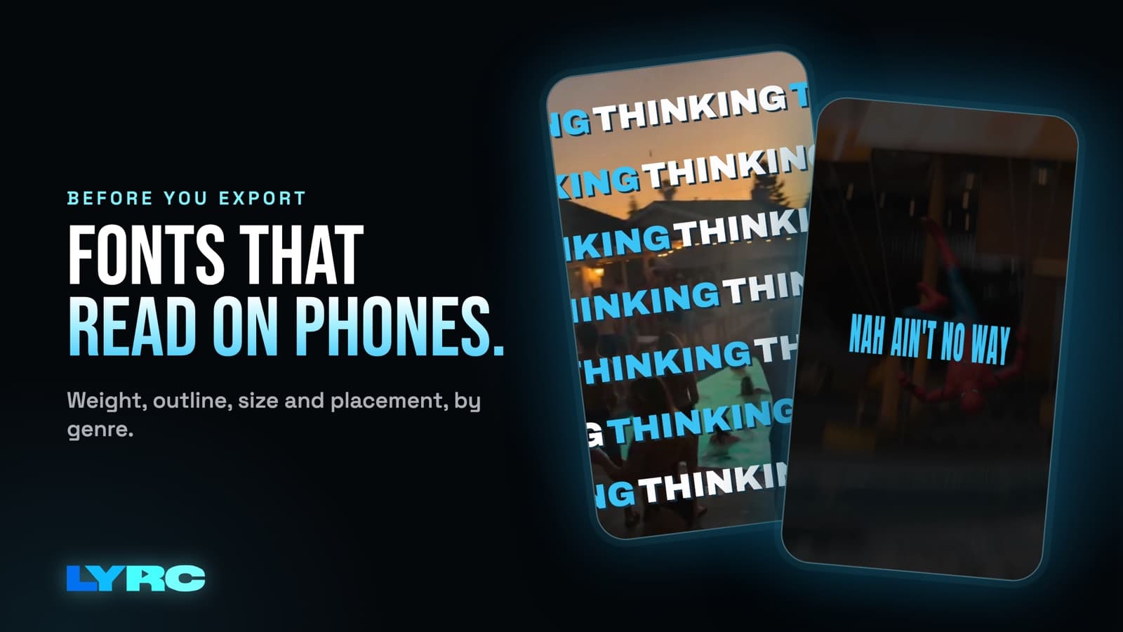
The best fonts for lyric videos are bold or semi-bold sans serifs: clean, heavy letters in the style of Montserrat, Inter, Anton or Bebas Neue. Use one main font, add an outline or soft shadow so it reads over any footage, make it big enough to read at arm's length, and keep it in the middle of the frame, away from the TikTok and Reels buttons. Save thin serifs, scripts and handwritten fonts for one emphasis word or a title card. A lyric video gets watched for a few seconds on a small screen, often with the footage moving behind it. A font that's hard to read in that moment won't get a second look.
I'm Andrew Loya. I make music and I built LYRC. Here's what reads on a phone, and how to match a font to your sound.
What makes lyric text readable on a phone?
Four things matter more than which font family you pick.
- Weight. Thin and light weights fall apart on a phone, especially when the video gets compressed after upload. Use bold or semi-bold for the lyric lines. If a font only looks good in its light weight, it's the wrong font for lyrics.
- Contrast with the footage. White text on a bright sky disappears. You can't control every frame of b-roll, so give the text its own edge with an outline or shadow (more on that below).
- Size. Go bigger than feels right on your laptop. Hold your phone at arm's length while the preview plays. If you have to lean in to read a line, scale it up.
- Line length. Show a few words at a time, one short phrase per line. A whole bar crammed onto one line forces a smaller font size and makes the viewer read faster than the song moves.
Simple letter shapes help too. Fonts with open, even letters (where the a, e and o don't close up) stay readable at small sizes and in motion. Decorative fonts with swashes, tight spacing or distressed textures look great in a still graphic and blur together once the words animate.
Where should lyrics sit on a vertical video?
Reels, TikTok and Shorts are vertical, 9:16 (1080x1920). Each app puts its own stuff over your video: the caption and username along the bottom, and the like, comment and share buttons down the right side. Lyrics placed low or hugging the right edge get covered.
Keep the lyrics in the center band of the frame, a little above the middle if anything, with some room from the left and right edges. Then check it on your phone: LYRC runs in mobile browsers, so play the preview there and make sure no line sits in the bottom or right areas. For a final check, post the export to a private or draft spot and watch it in the actual app with the interface on top. Exports count against your plan, so do that with a video you'd post anyway.
For a 16:9 YouTube video, you have more room, and lower-center placement works fine because there are no side buttons. The full walkthrough for that format is in how to make a lyric video for YouTube.
Outline, shadow or glow: which one should you use?
All three exist to keep text readable over footage you didn't pick frame by frame. They each give a different feel.
- Outline (stroke): the most reliable. A dark outline on white text (or the reverse) reads over almost anything. Keep it thin enough that the letter shapes don't clog up, especially on letters like e and a.
- Drop shadow: softer and more polished. A soft, slightly offset dark shadow works well for R&B and pop where a hard outline looks too loud.
- Glow: a stylized look that suits night footage, neon and moodier songs. A colored glow over dark clips looks great; over bright clips it can wash out, so check the brightest shot in your video.
If you're unsure, start with white text and a dark shadow. It's the safest look and works across genres.
Best font styles for lyric videos by genre
Treat these as style families. The font names are examples of a look so you know what to search for.
Hip-hop and rap
Heavy, condensed sans serifs in all caps, the Anton and Bebas Neue style. Condensed letters let you fit more syllables on a line, which matters when a verse moves fast. Punch one word per bar in a bigger size or a different color on the emphasis. For more on fast verses, see lyric video maker for rappers.
R&B
A clean sans in mixed case, or an elegant serif used in a heavier weight than you'd normally pick. Pair it with a soft shadow instead of a hard outline. Lowercase lyrics can feel more intimate here, as long as the weight stays solid.
Pop
Rounded or geometric bold sans (think the Poppins and Montserrat family of shapes). Friendly, wide letters with a bit of color. Pop tends to carry a bolder accent color on the hook words.
Alternative, indie and emo
This is where serif, typewriter and handwritten styles fit. Handwritten fonts work if you pick one with thick strokes and use it for short lines, since thin scribbled handwriting is the hardest thing to read on a phone. Typewriter fonts look great but are often thin, so add an outline.
AI-made songs
The same genre rules apply. Pick the font for the sound of the song.
How many fonts should a lyric video use?
One main font for the lyrics. A second font is fine for a single emphasis word or a title, as long as it's clearly different (a script next to a bold sans, for example). Two similar sans serifs side by side just look like a mistake.
The bigger lever for consistency is reuse. If you post several videos of the same song, keep the font the same across all of them. Keeping one look makes the series feel connected. More on that in how many videos to post per song.
When to use a preset instead of picking a font
Besides the font, the look depends on how the words come in and leave: pop, fade, slide, word-by-word highlight. Matching a font to an animation by hand takes time, and the animation can make a good font hard to read if it moves too much.
Use a lyric preset when:
- You want a finished look fast and don't have a strong opinion on the exact font.
- You're making several videos of one song and want them all to match.
- Your fast verses make manual timing and styling painful.
Go manual when you have a brand font you already use on your cover art and socials, or your genre has a look the presets don't quite hit. In LYRC you can pick a lyric animation preset, or turn presets off and set the font, size, colors, outline, shadow, glow and animation yourself (more on lyric animation). Paid plans can upload your own .ttf or .otf font file. Check the font's license allows video use before you upload it. The editor masterclass shows where each text setting is.
If you'd rather build it in a general editor, CapCut has text styling and an Auto Lyric feature, and Premiere and DaVinci give you full control over type. For a full-length lyric video, those are the better fit. I compare the two approaches in LYRC vs CapCut.
Common font mistakes in lyric videos
- Light weights. They look elegant in the editor and vanish after compression.
- No outline or shadow. One bright clip and the line is gone.
- Text in the bottom fifth of the frame. The app caption covers it.
- Too many words on screen. Readers fall behind the song and give up.
- A different font every video of the same song. You lose the recognition you've been building.
- Animation fighting the font. Heavy shake or blur effects plus a thin font equals unreadable. Pick one to be loud.
For more on motion, read how to animate lyrics.
FAQ
What's the single safest font style for a lyric video? A bold sans serif in white with a dark shadow or thin outline. It reads over almost any footage on any platform.
Should lyrics be all caps? All caps works well for hip-hop and loud hooks with condensed fonts. For long lines or softer songs, mixed case is easier to read.
Can I use script or handwritten fonts? Yes, for one word or a short line, in a thick stroke with an outline. Full verses in thin script are hard to read on a phone.
Do I need a different font for TikTok, Reels and Shorts? No. All three are 9:16 with app buttons on the bottom and right, so the same font and center placement work on all of them.
Can I use my own font in LYRC? Paid plans can upload .ttf or .otf files. On any plan you can turn presets off and style the text by hand.
How LYRC does this
- Upload your song and trim a 15 to 30 second section, usually the hook.
- LYRC transcribes the lyrics and times each word. Review it and fix any names, slang or ad-libs it missed.
- Cut markers land on the kicks and claps. Add, remove or nudge any of them.
- The lyrics, timing, cut markers and style save as a song template, so your next video of the song starts with your font and look already set.
- Fill puts a clip in every slot from LYRC stock, your own footage, a YouTube or TikTok link, or AI b-roll. Clips from other people's videos, films or shows can draw copyright claims or muted audio, so your own footage, stock and AI b-roll are the safer picks.
- Pick a lyric preset or turn presets off and set the font, outline, shadow and glow by hand, then shuffle the clips and export in 9:16 or 16:9.
Your first video export is free when you sign up. It carries a small LYRC watermark. Building and previewing are free on the Free plan, and paid plan limits are on the pricing page.
Make music. Not content.
Set up lyrics and timing once, then use the same song template for your next video.
Start free